Are you a fan of the honeycomb screen for your Apple Watch? I like the way it looks, but it is certainly not the easiest thing to use, searching for tiny icons that often look very similar, and then trying to tap them with big fingers.
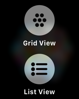
In watchOS 4 Apple have provided a "List View", but it's not immediately obvious how to get it.
However once you know how, it's super simple - just force press on the honeycomb app screen to get the "List View" option - once you do it it will stay that way until you change it back.
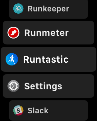
Now you can quickly scroll through an alphabetically list of apps using the digital crown. You get the name of the app and the icon, and a nice big tap target.
it's much quicker and easier to use :)


